iipoke
Metica retail thinking together with Pan identity created in 2017 a new brand for a poke restaurant. The character of the brand is vibrant, casual, smart and urban. This four adjetives have been used by M+P architects to design the new poke experience.
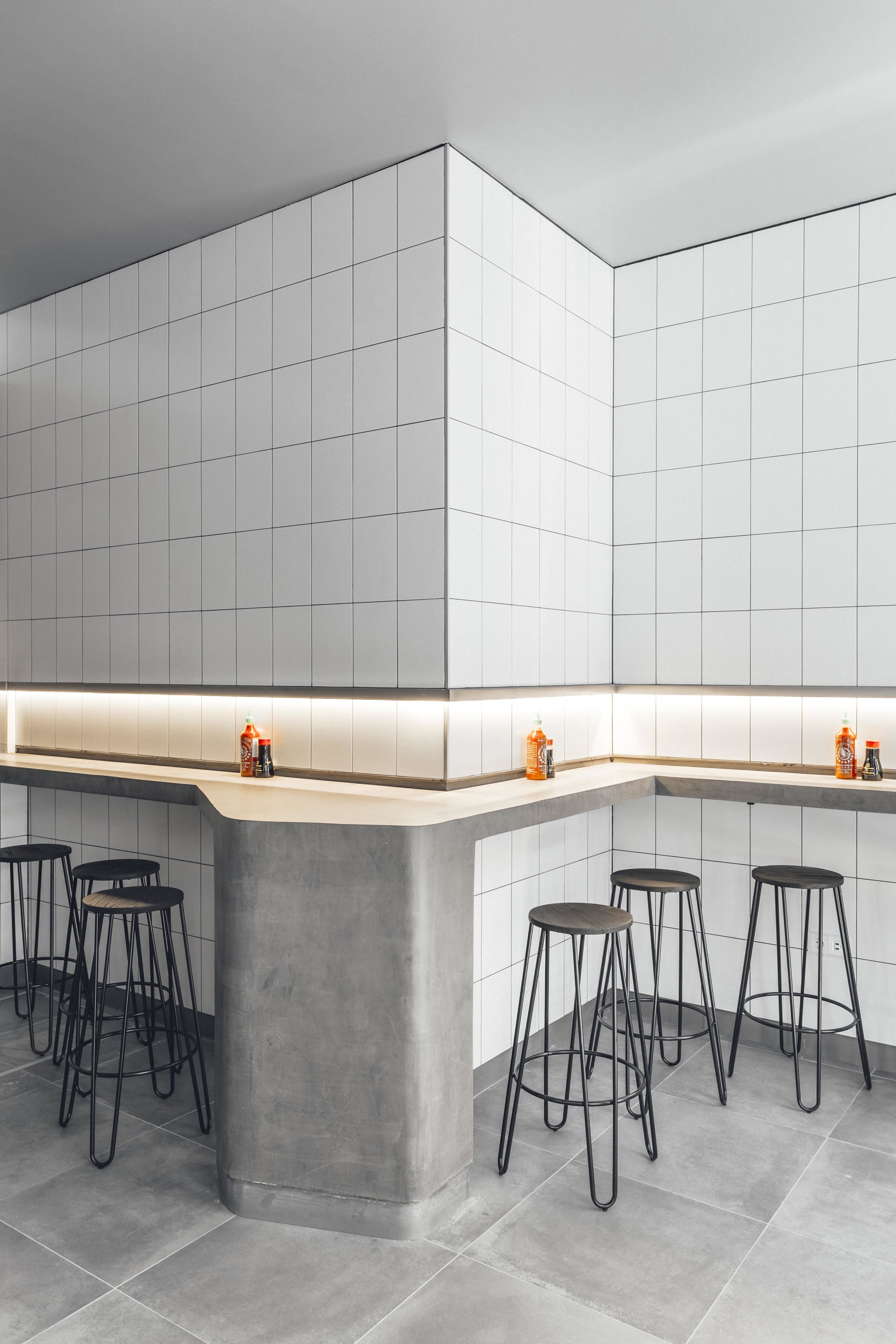
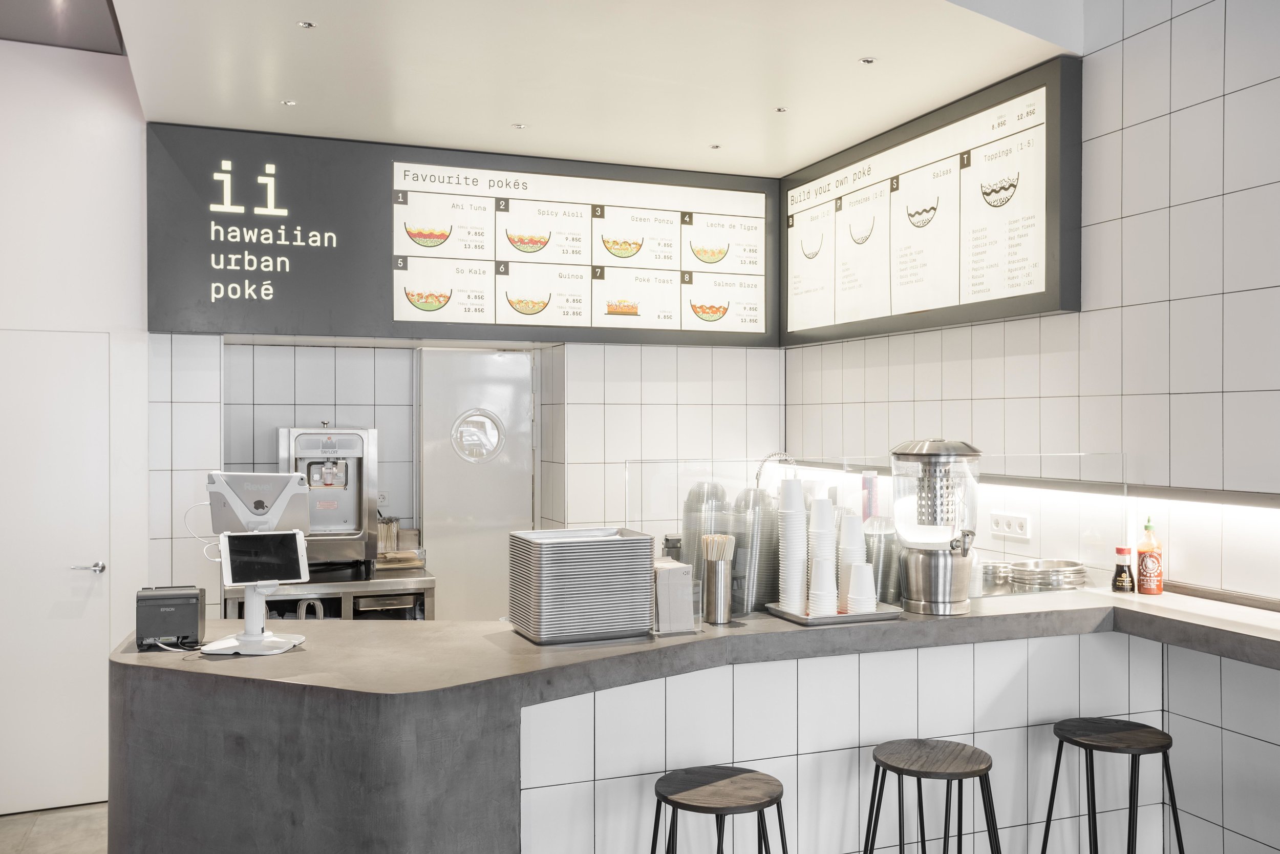
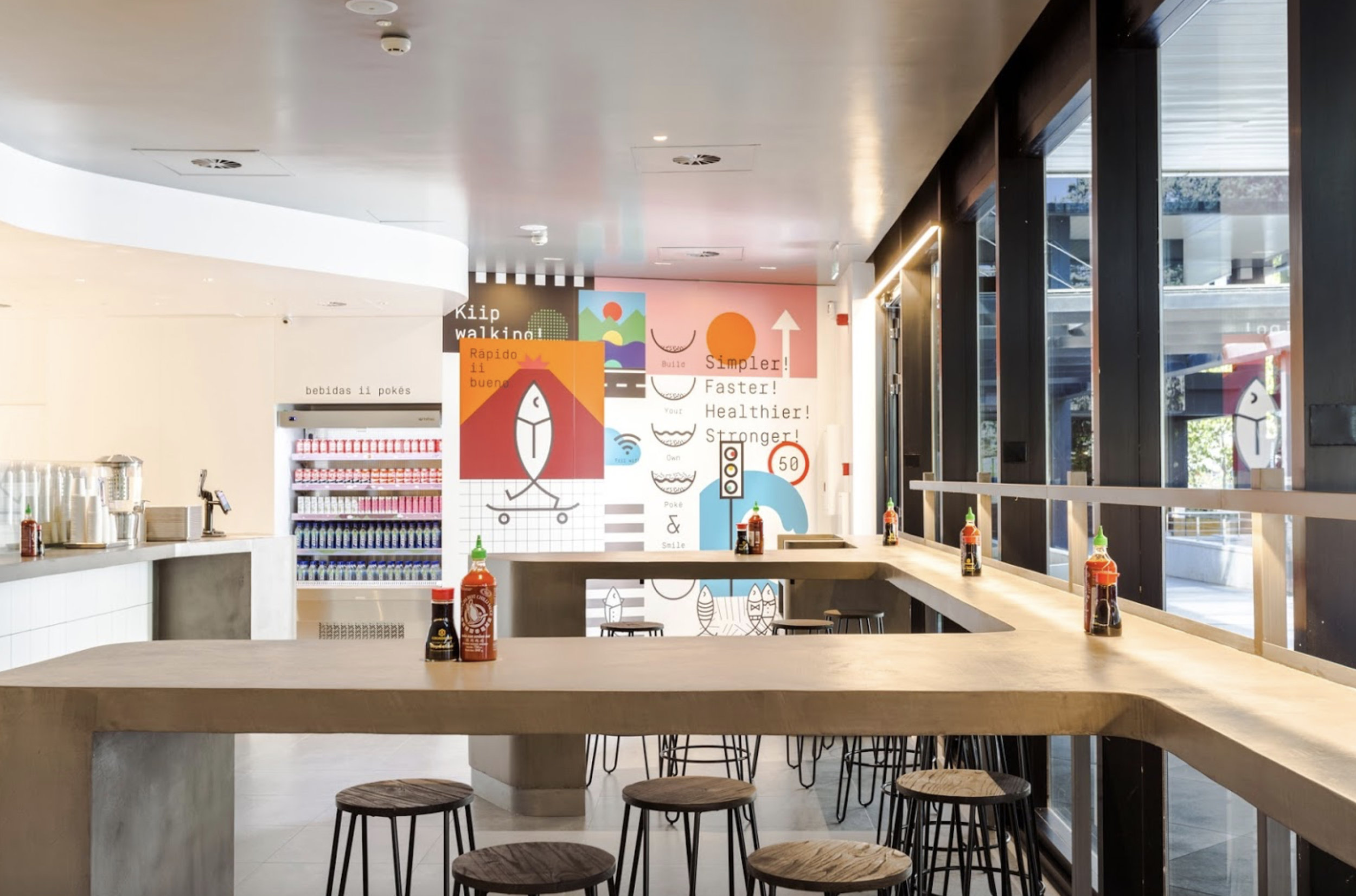
The iipoke space work is divided in three parts: An urban facade, a casual dining area, and a vibrant kitchen. These areas are connected by a concrete bar. Its a simple concept which we have implemented on two sites in Madrid: C/Argensola, 17 and Paseo de la Castellana 280, Madrid.
M+P Architects has designed, implemented and build two restaurants.
You can visit Metica retail thinking here.
Urban furniture
The urban concept is applied from the graphic walls to the concrete furniture.
Instagramable place
ii Hawaiian Urban Poké has beed designed for millennial people who can take photos in all restaurant corners.
Light and material
There are only two materials, because the important thing is the poke salad.
The lighting concept reenforces the concrete bar.
This project has been published in Retail Design Blog: Link


